
 RU
 UZ
RM Mart
Supermarket branding
-

Logo
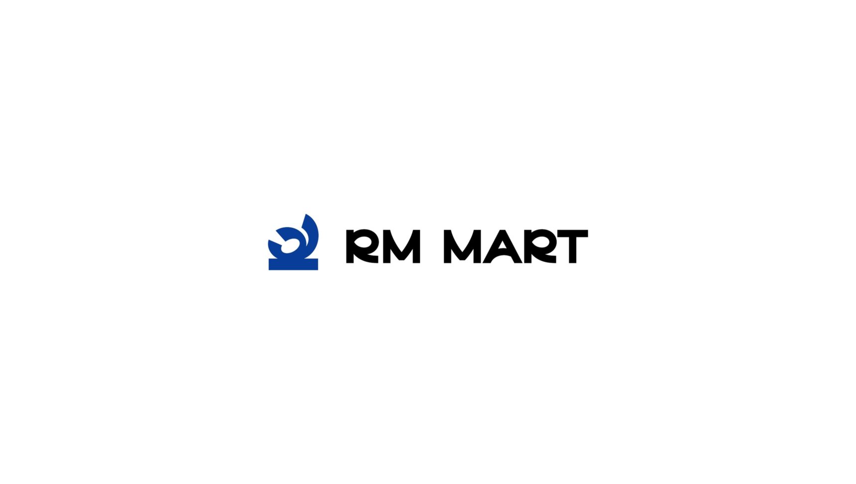
The R in the mark curls like a finger-licking-good gesture: a sign of taste and freshness.
-
Colour and type
Main blue, sky blue, sunlight yellow and an extra red. A rounded grotesque typeface.
-
Graphics
A pattern built from the mark and bold supergraphics for bags, packaging and ads.
-
Applications
Shopping bags, price tags, department banners, billboard, facade, packaging, uniform, truck and social media.


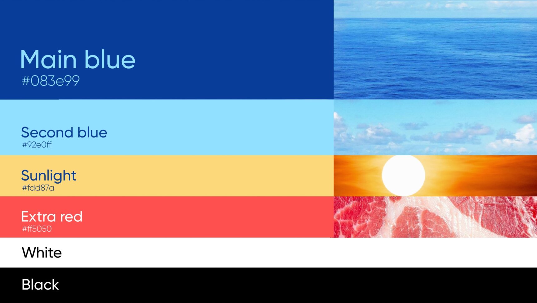
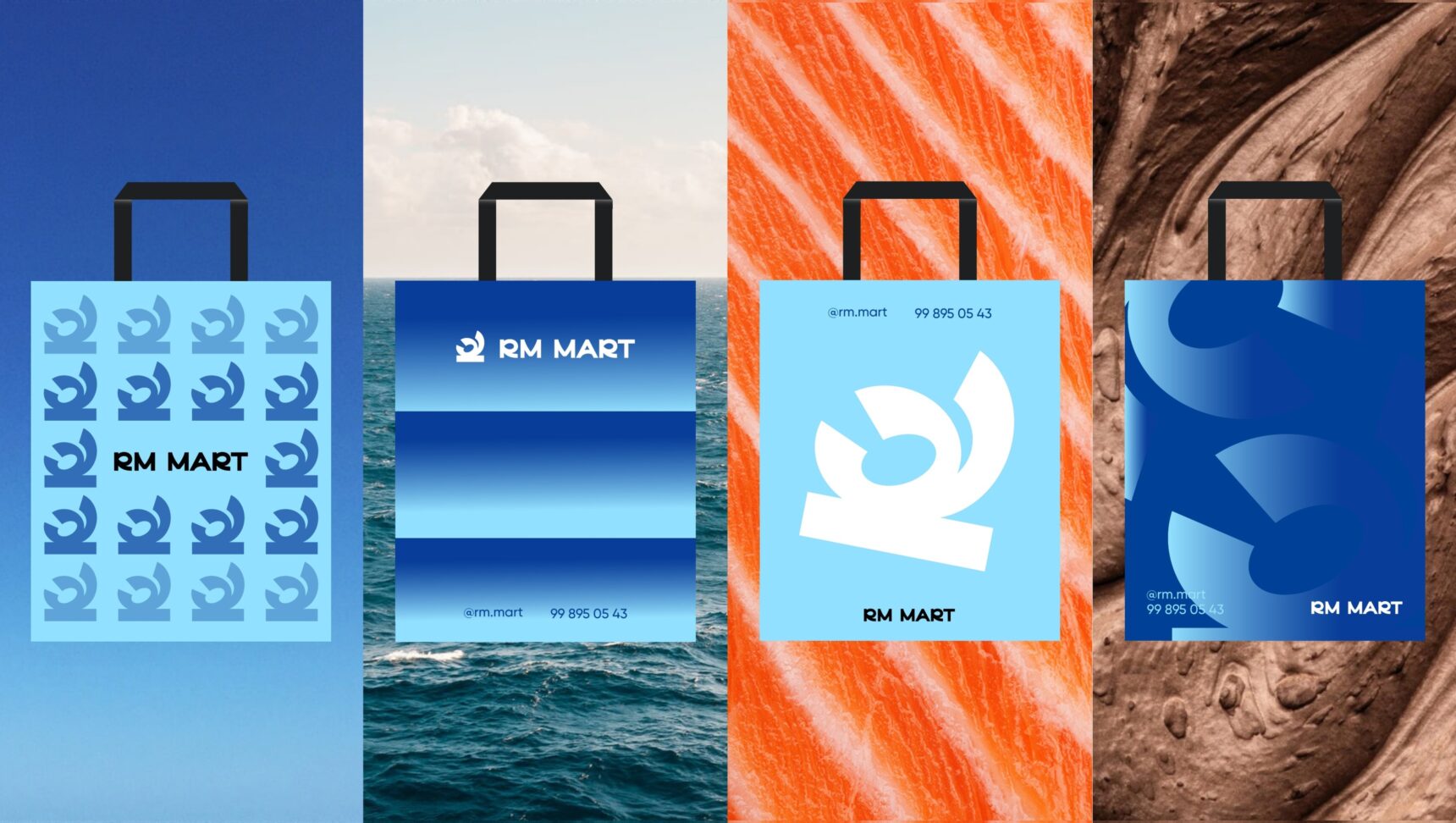

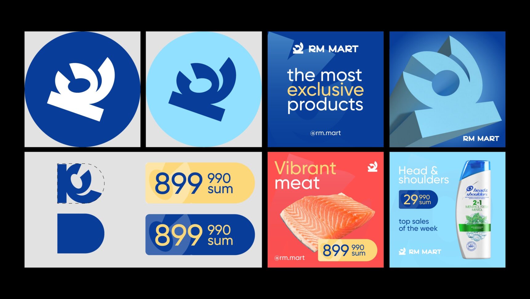
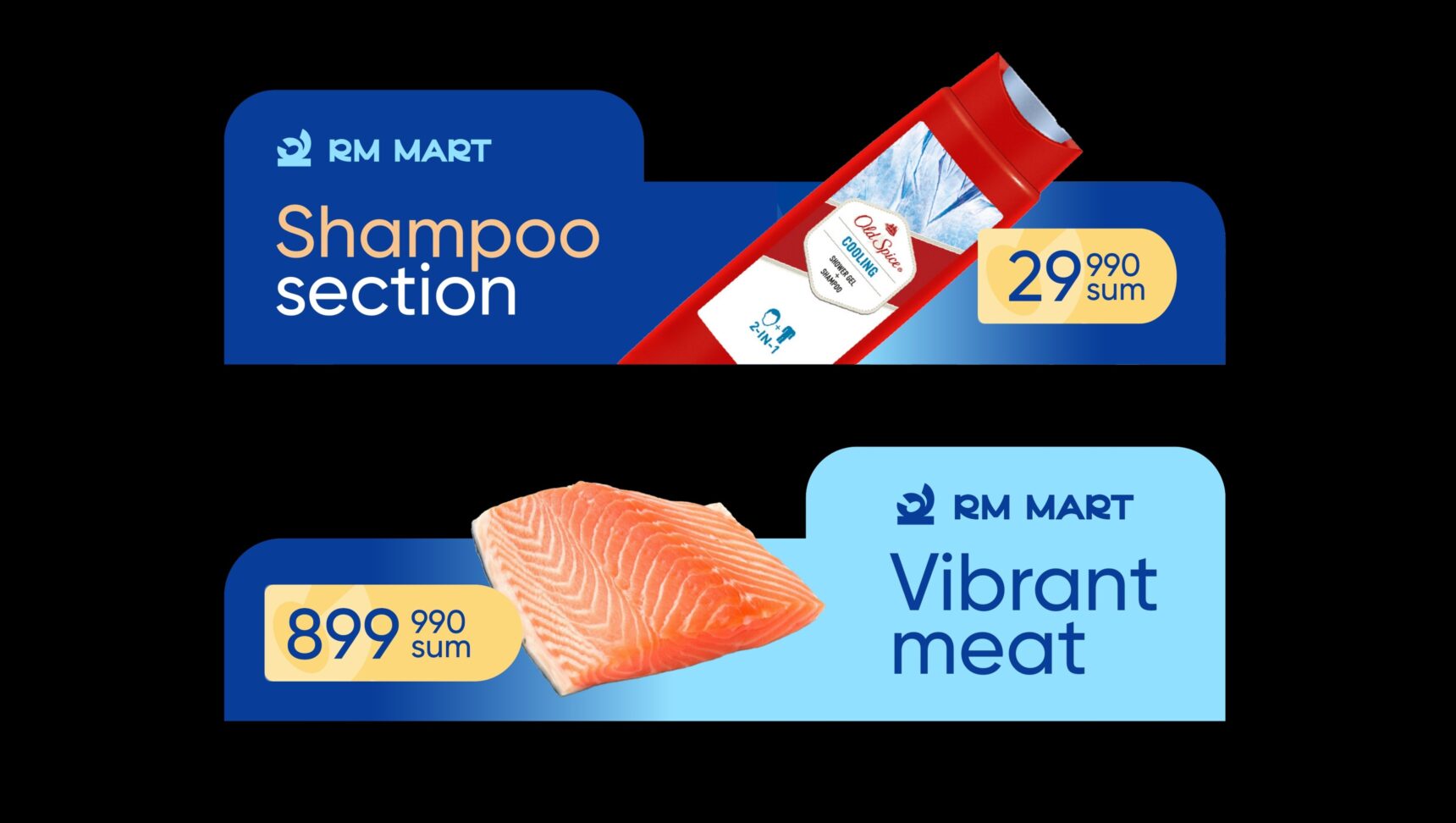
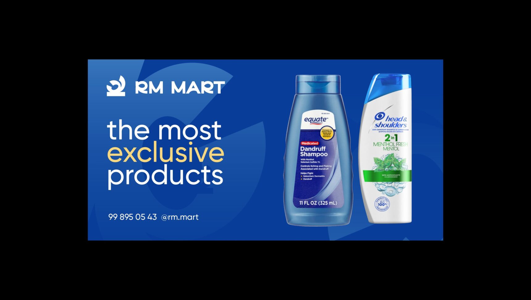
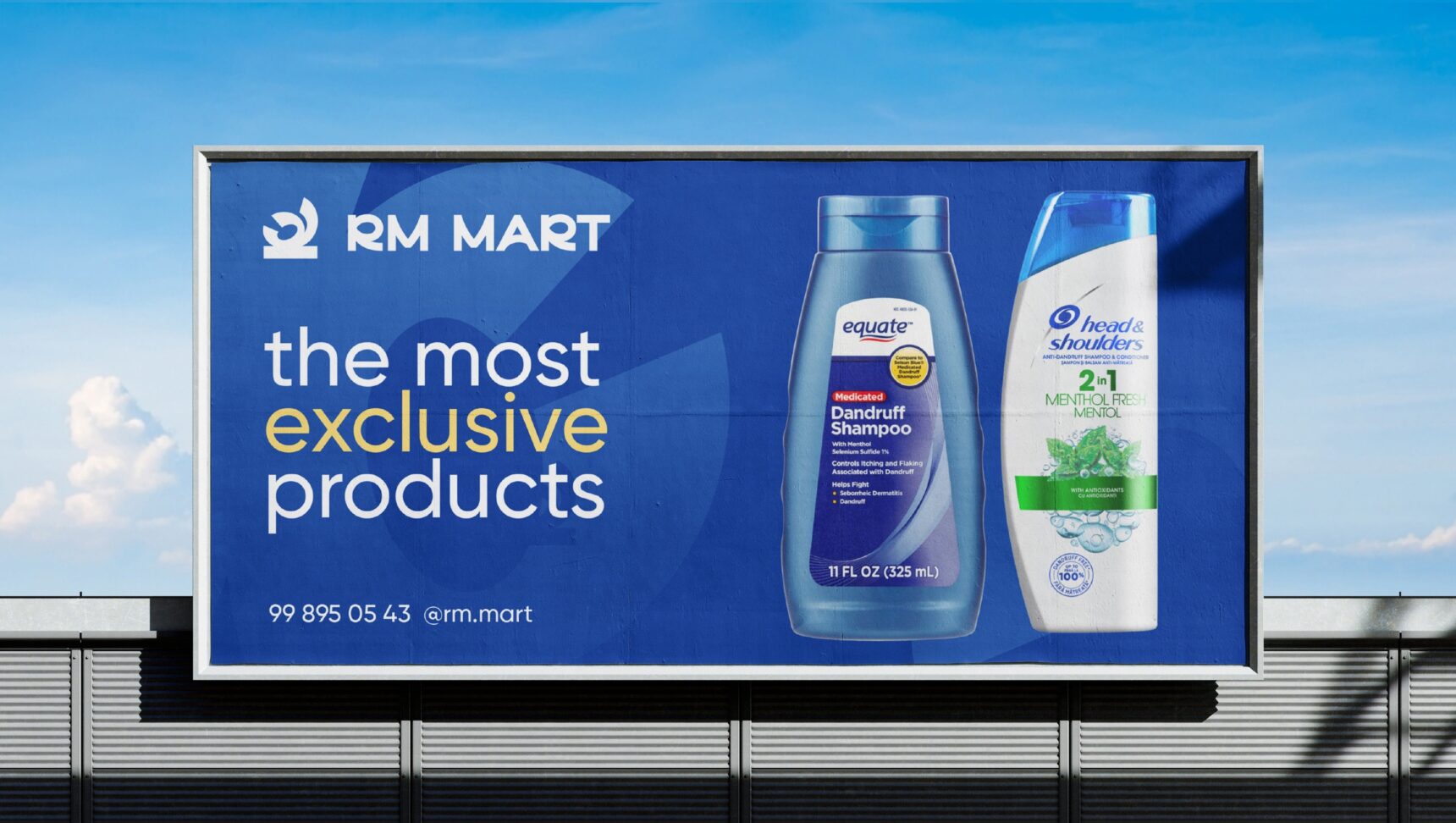
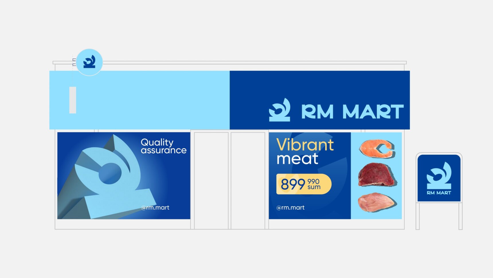
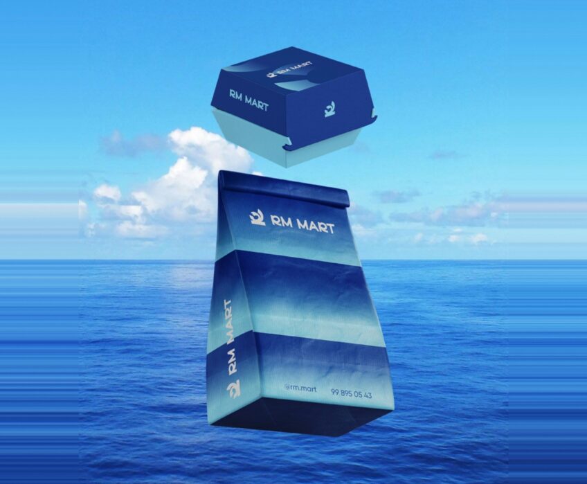
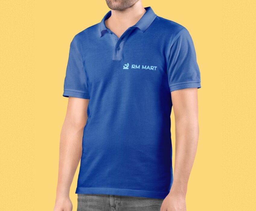
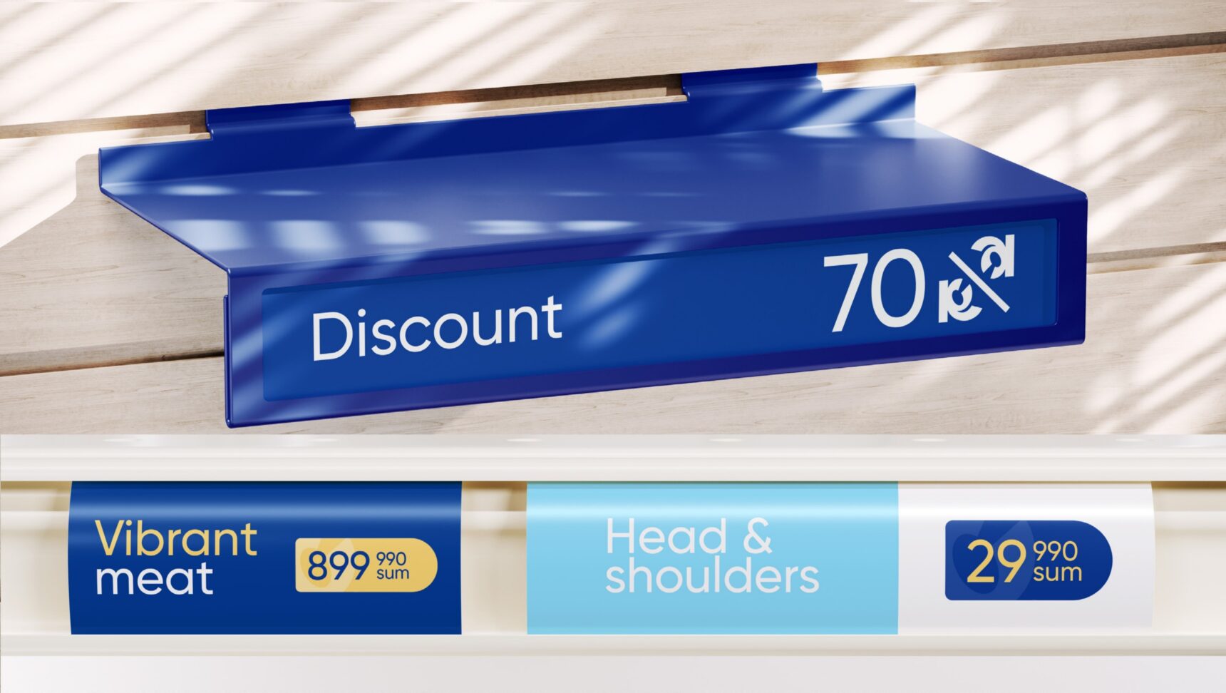
RM Mart is a supermarket focused on quality, fresh products. We took the palette from nature: sea, sky, sun and marbled meat. The bright blue mark and prices on yellow tags make the store stand out on the shelf, on the road and in the feed.

Ready to scale your business?
Book a consultation and we will discuss which strategy fits you best.
