
 RU
 UZ
Hikaya
Restaurant branding
-

Logo
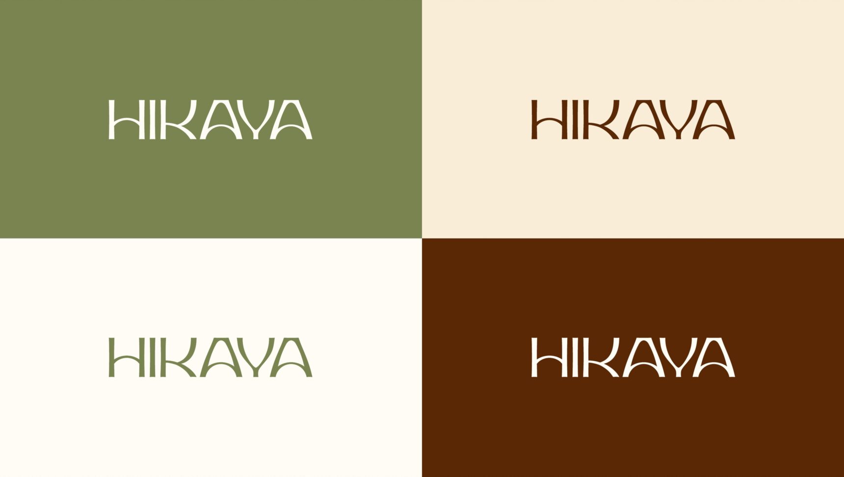
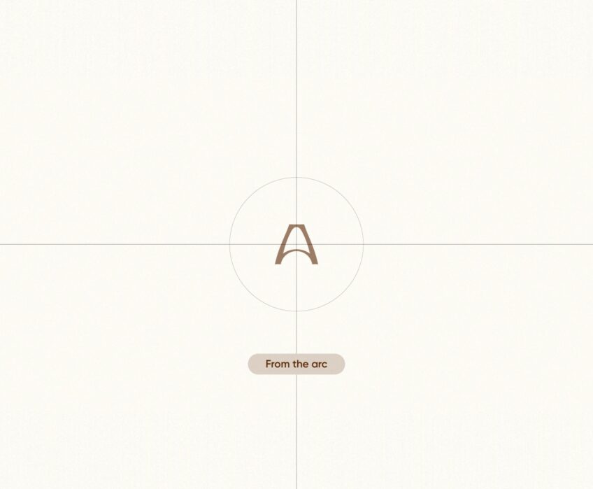
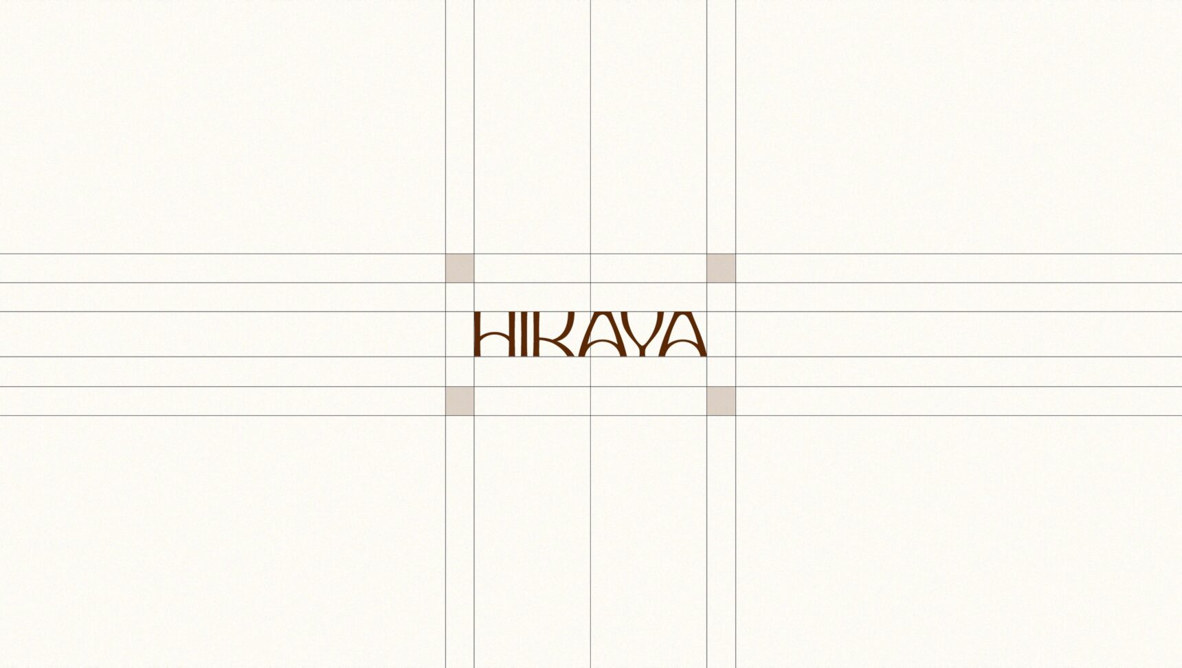
The HIKAYA lettering grew out of the entrance arch: the letter A follows its curve.
-
Colour and type
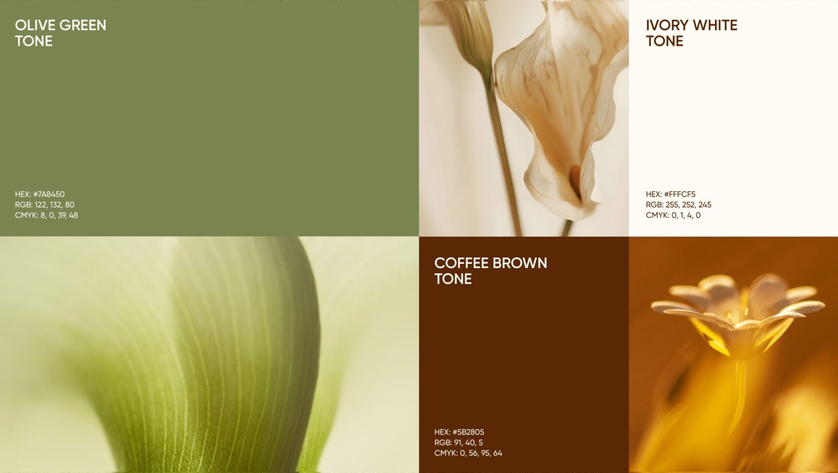
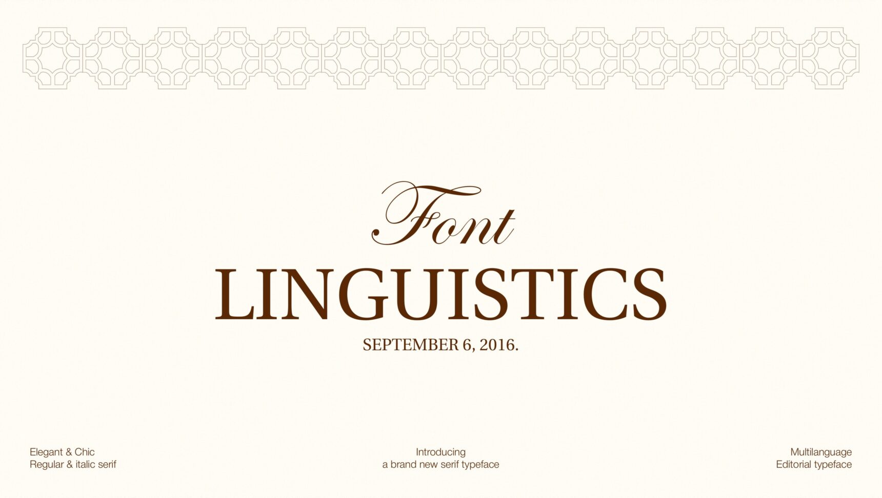
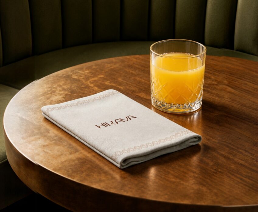
Olive, ivory and coffee. An elegant serif for menus and headlines.
-
Patterns
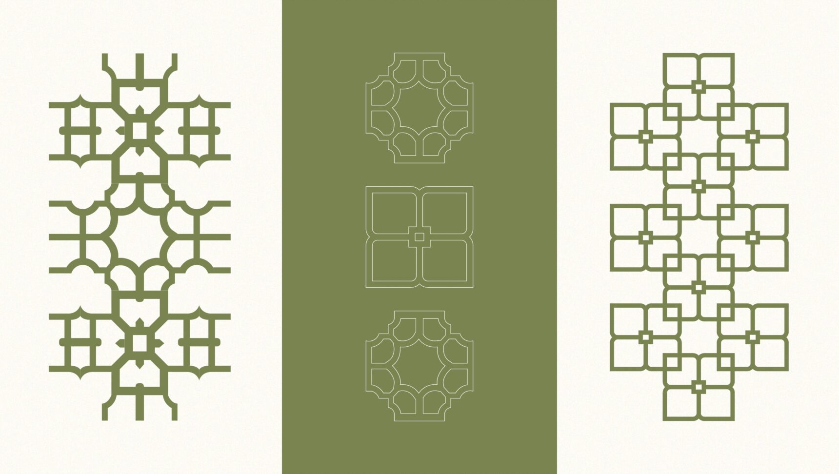
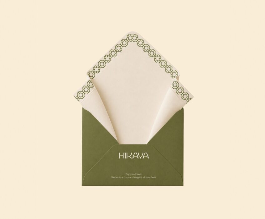
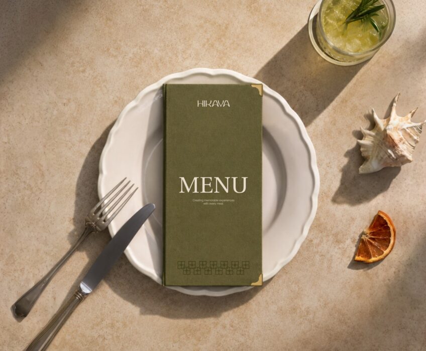
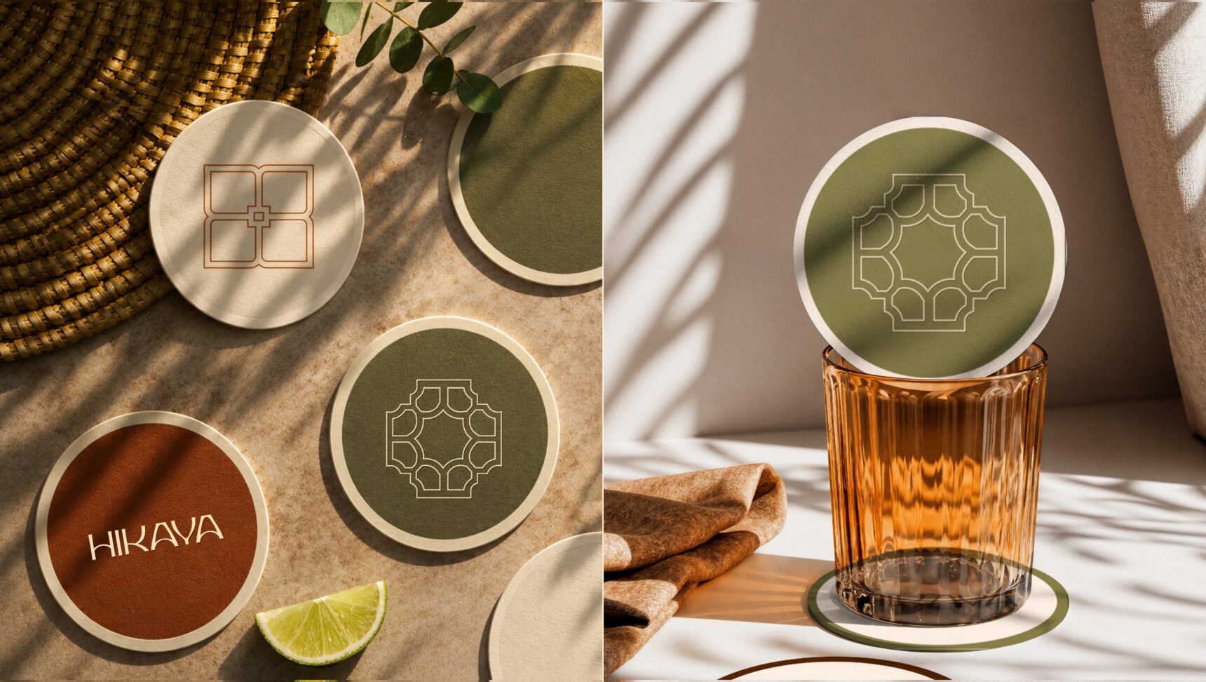
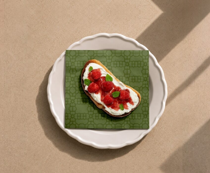
Four ornaments based on the hall's wooden lattice screens, for napkins, menus and packaging.
-
Applications
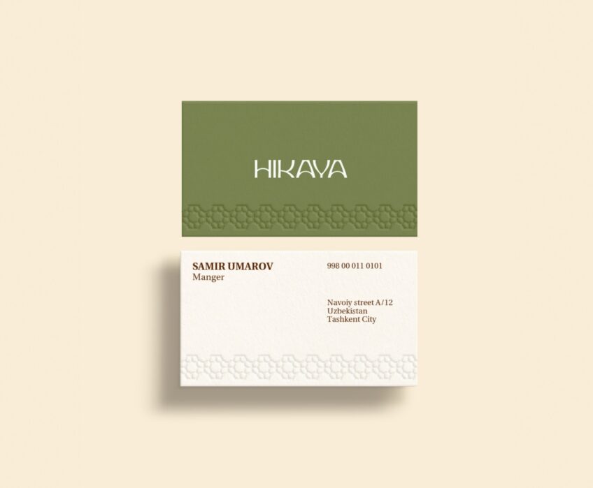
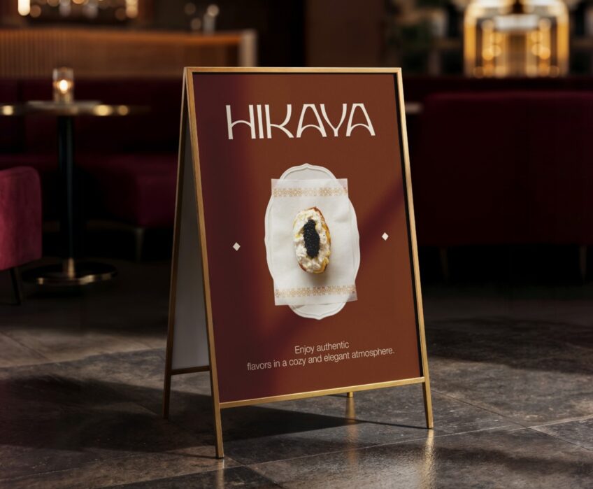
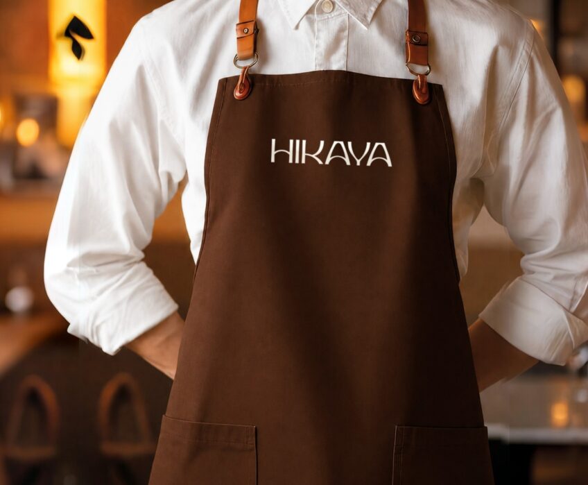
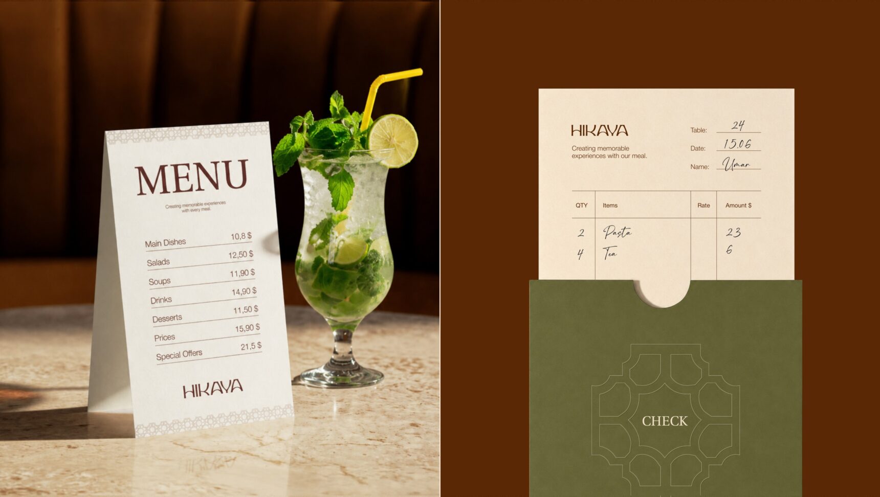
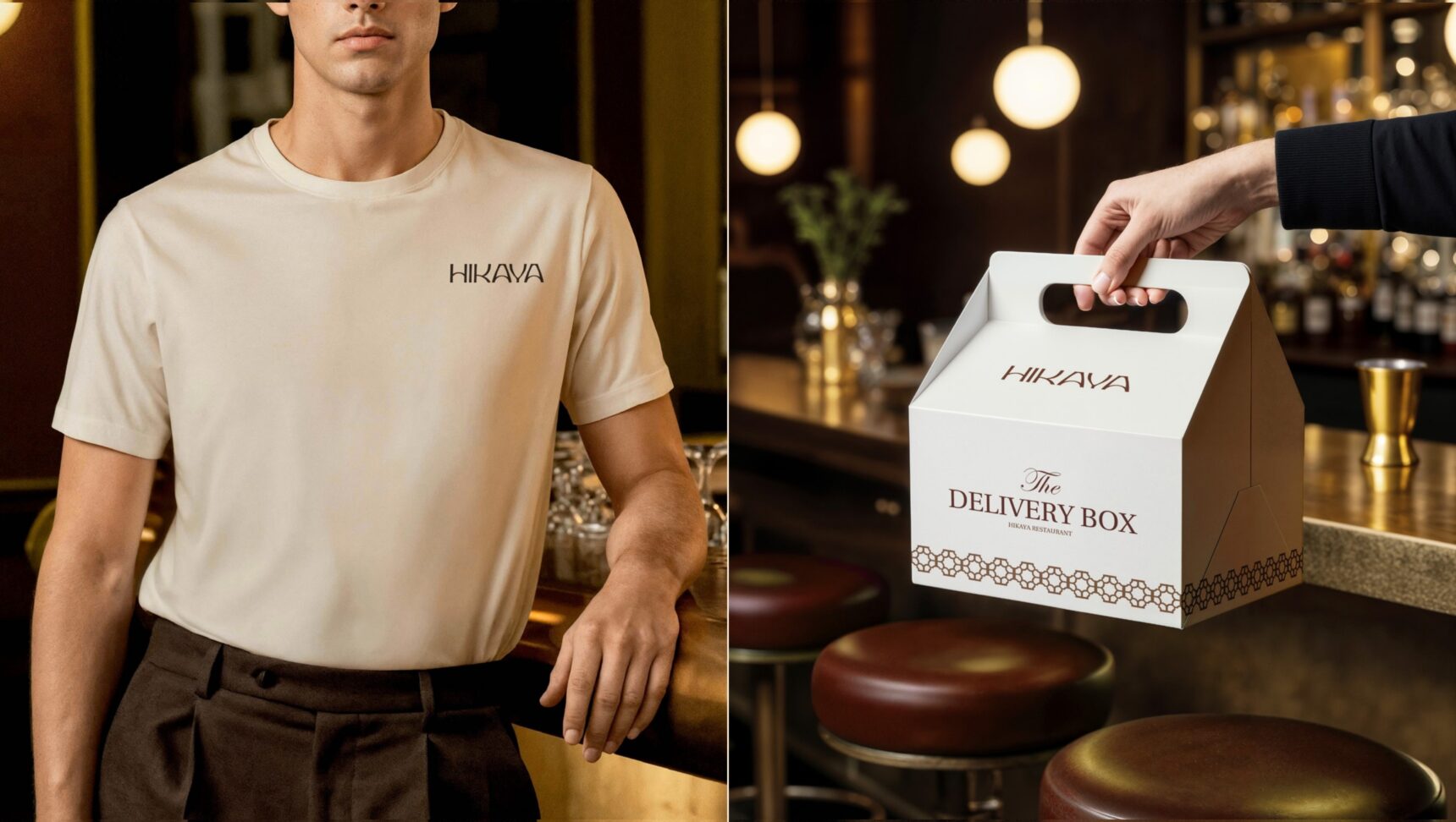
Business cards, menu, check holder, coasters, apron, delivery box, signage and Instagram templates.
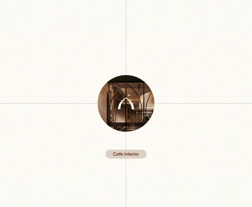
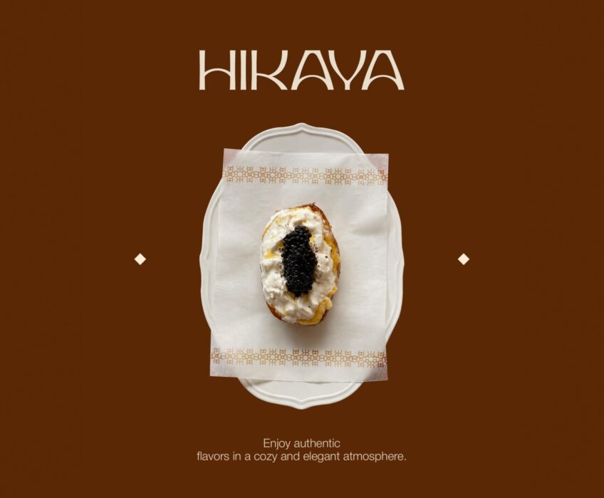
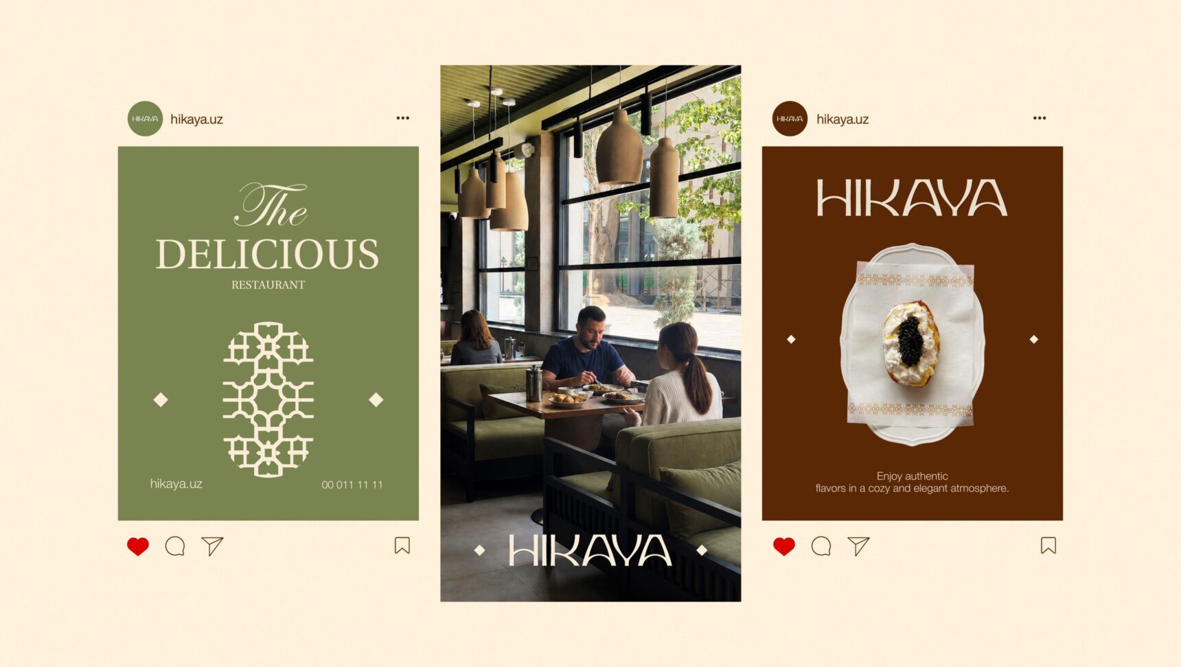
Hikaya is a restaurant with oriental architecture and a calm, cosy atmosphere. We built the identity from what guests already see in the hall: arches, wooden lattice screens, olive velvet sofas. That is why the brand is recognisable on the sign, on a napkin and in the Instagram feed.

Ready to scale your business?
Book a consultation and we will discuss which strategy fits you best.
