RM Mart

Supermarket branding

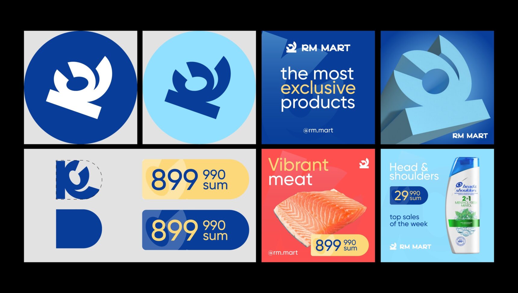
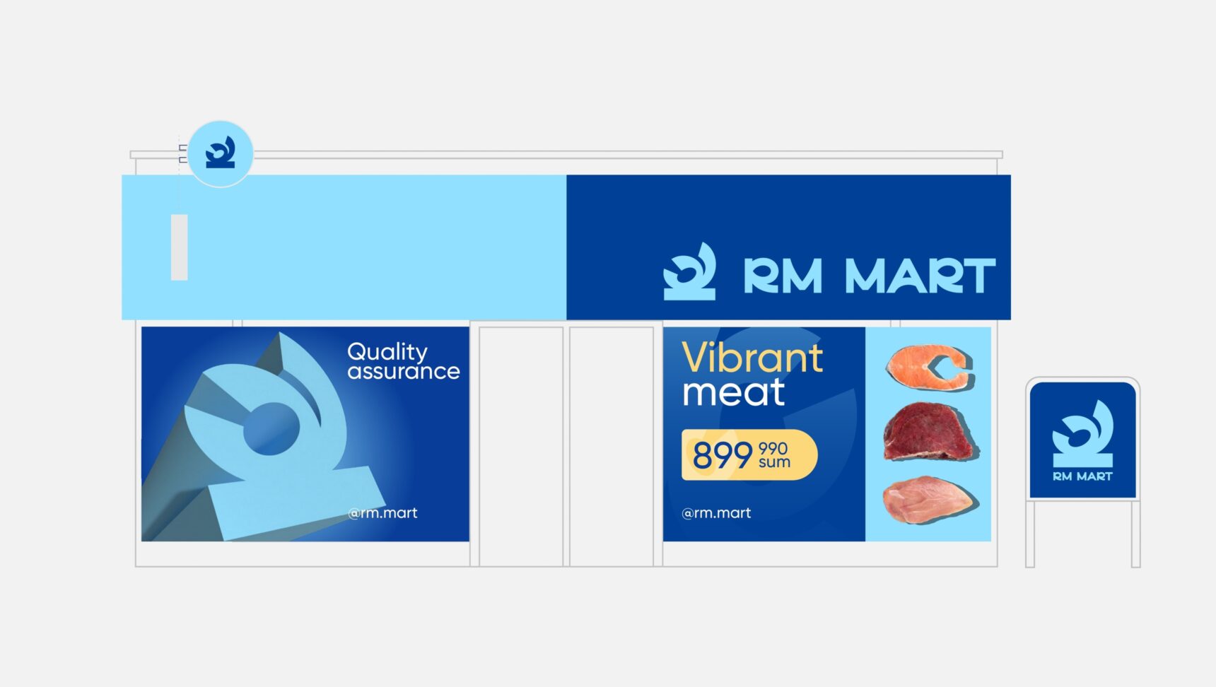
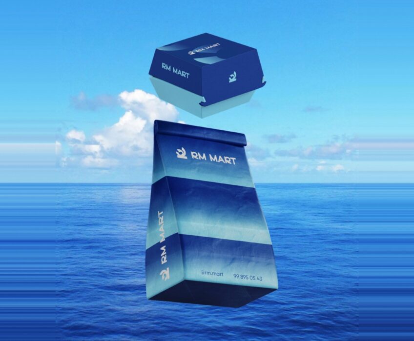
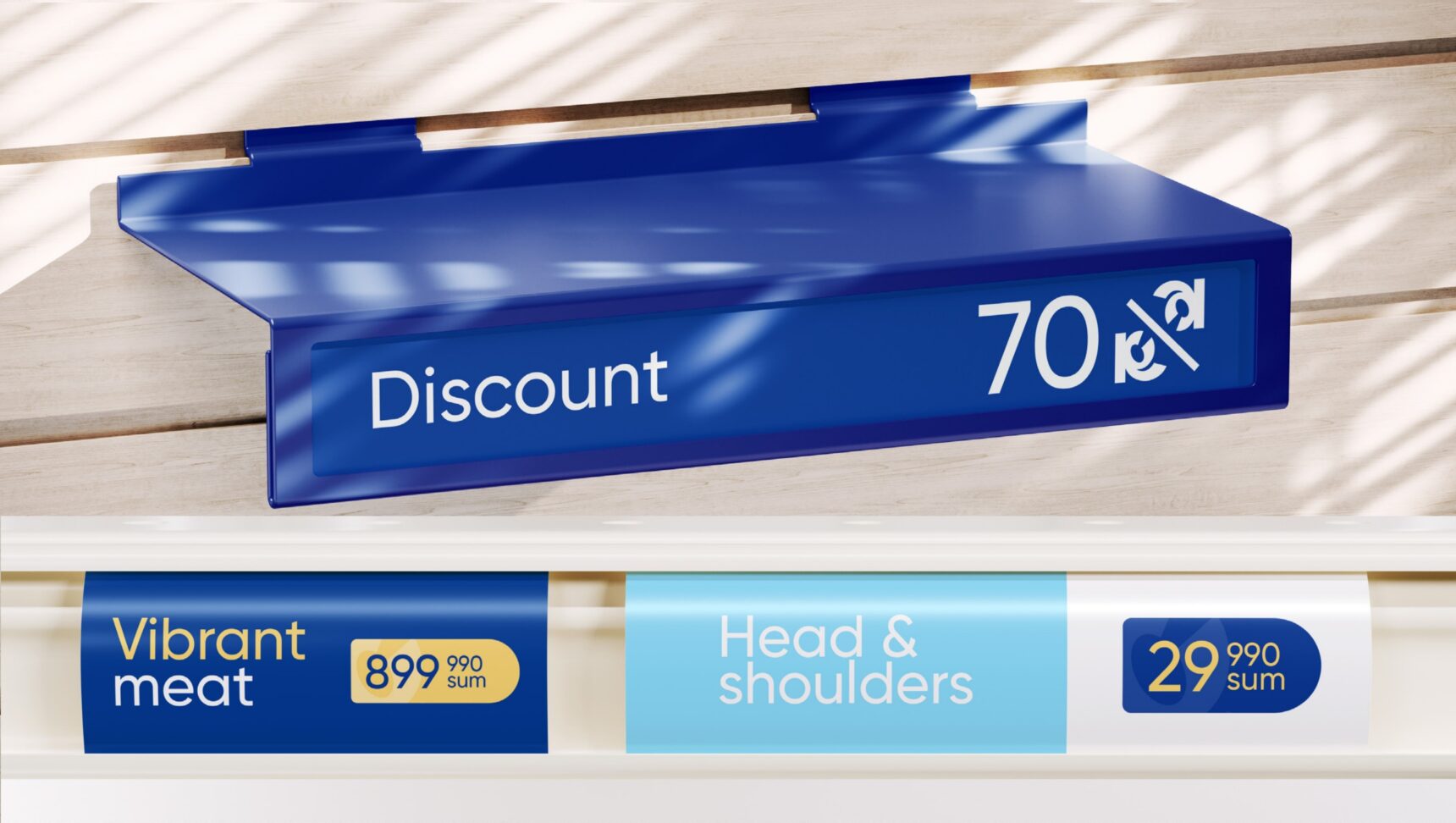
We built the identity of RM Mart supermarket: a mark from the letter R, a palette of sea, sky and sun, supergraphics and a full set of applications, from price tags to the facade and delivery truck.
  • Logo

    The R in the mark curls like a finger-licking-good gesture: a sign of taste and freshness.

  • Colour and type

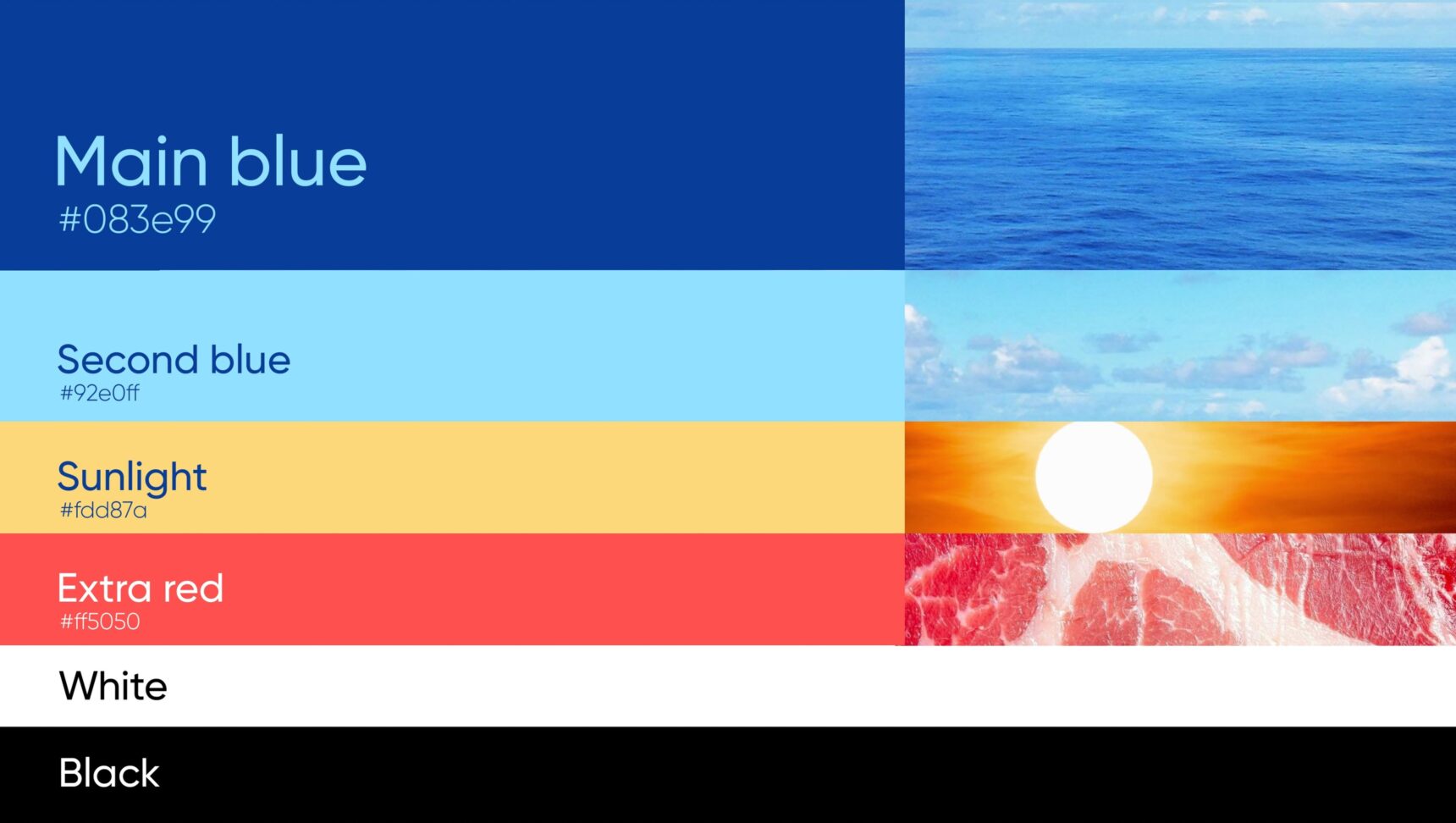
    Main blue, sky blue, sunlight yellow and an extra red. A rounded grotesque typeface.

  • Graphics

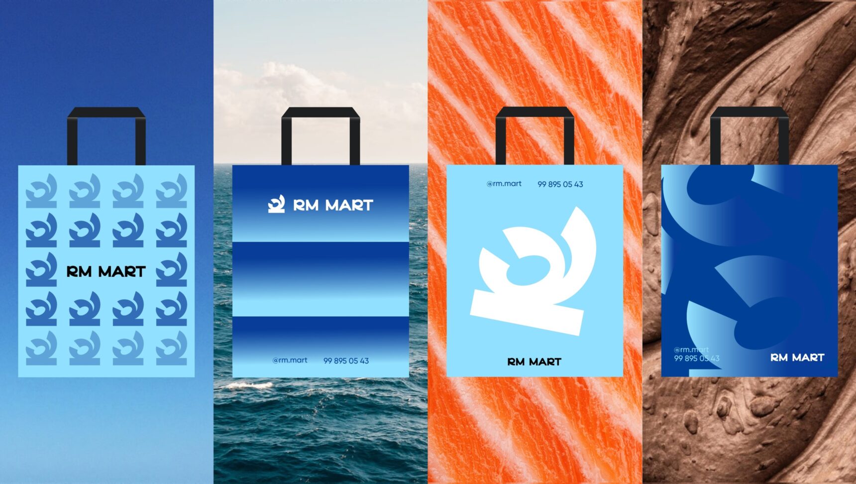
    A pattern built from the mark and bold supergraphics for bags, packaging and ads.

  • Applications

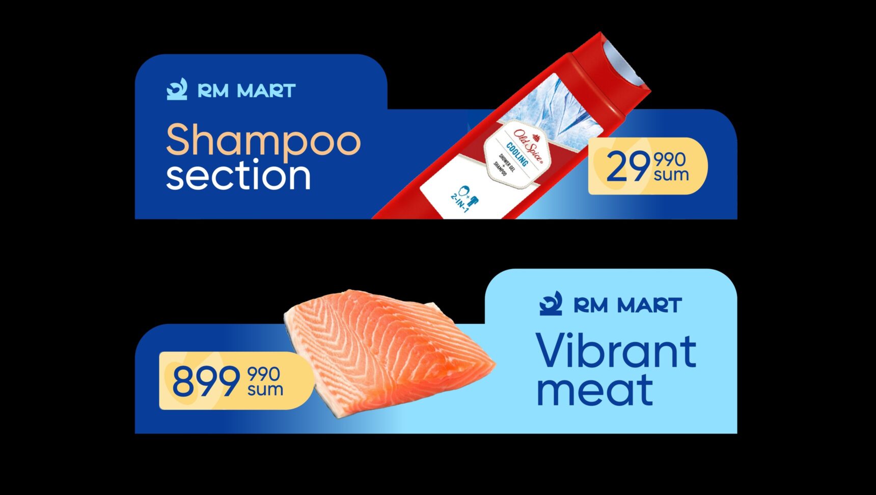
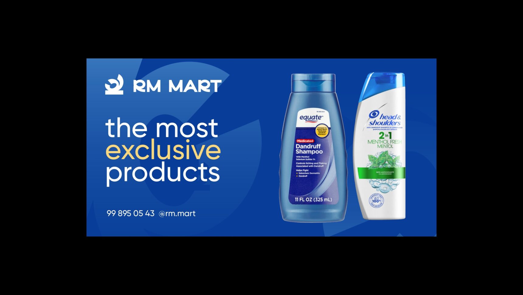
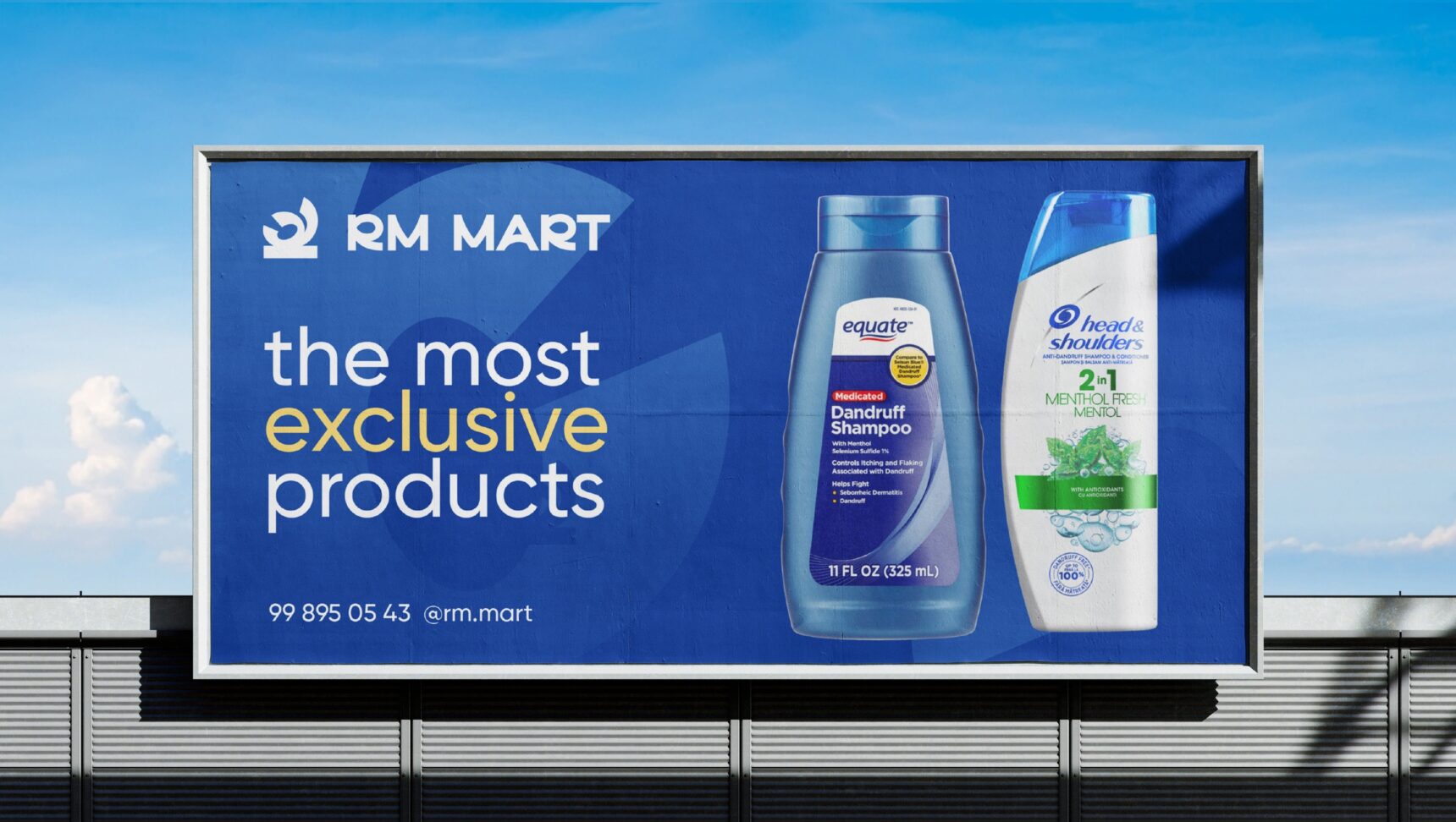
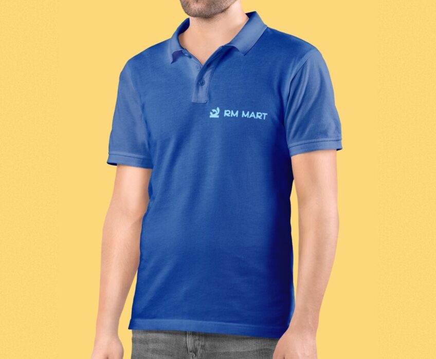
    Shopping bags, price tags, department banners, billboard, facade, packaging, uniform, truck and social media.

You may also like these projects:

View cases arrow
    • SMM
    • Instagram

    Pruddy

    SMM for a baby diaper brand

    • SMM
    • Instagram

    FurniGlass

    SMM for a furniture manufacturer

    Learn more arrow
    FurniGlass
    • SMM
    • Instagram

    Bahodirov

    SMM for a cheese producer

    Learn more arrow
    Bahodirov
    • SMM
    • Instagram

    Mono Electric

    SMM for an electrical accessories brand

    Learn more arrow
    Mono Electric
    • SMM
    • Instagram

    YEC Gilam

    SMM for a carpet manufacturer

    Learn more arrow
    YEC Gilam
    • SMM
    • Instagram

    Aventos

    SMM for HVAC and ventilation systems

    Learn more arrow
    Aventos
View cases arrow

Ready to scale your business?

Book a consultation and we will discuss which strategy fits you best.

Let’s Talk About Your Business.

We’ll discuss your goals and current challenges to identify the solutions that best fit your needs.

    close icon

    Отправка резюме

    Заполните форму и приложите файл резюме.

    close icon
    Thank you for reaching out! We’ve received your details. Our team will contact you to discuss your project.
    ×