Muhasib

IT company branding

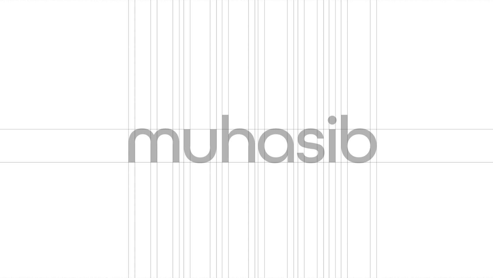
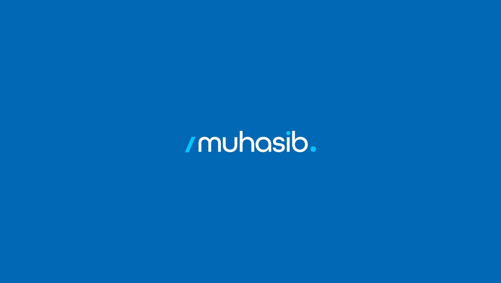
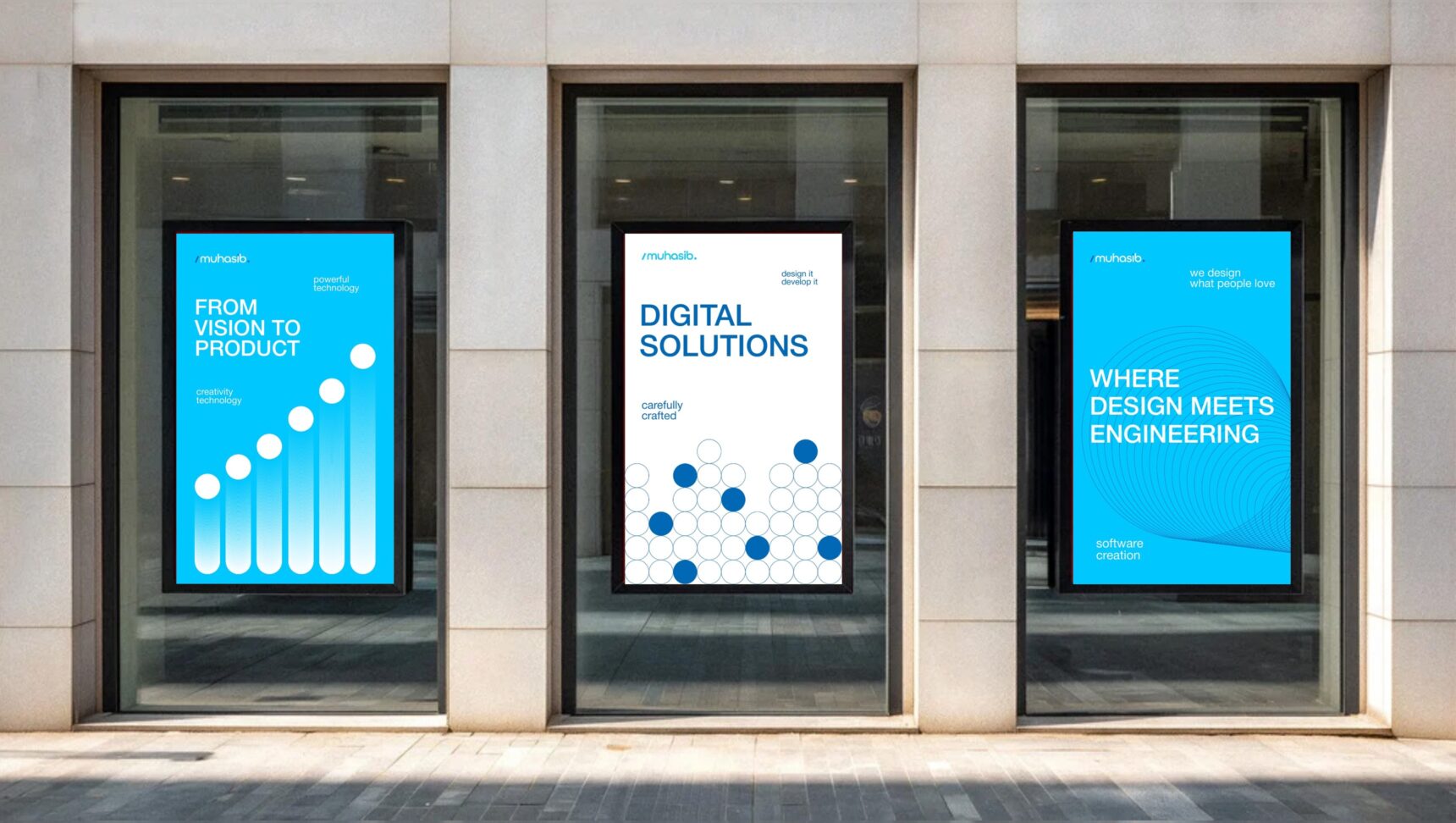
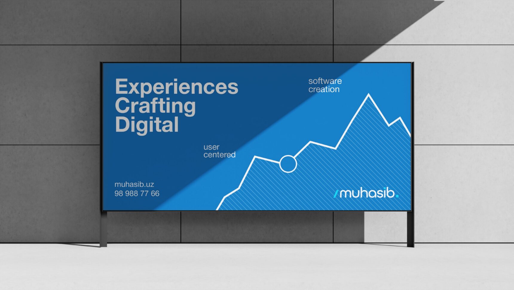
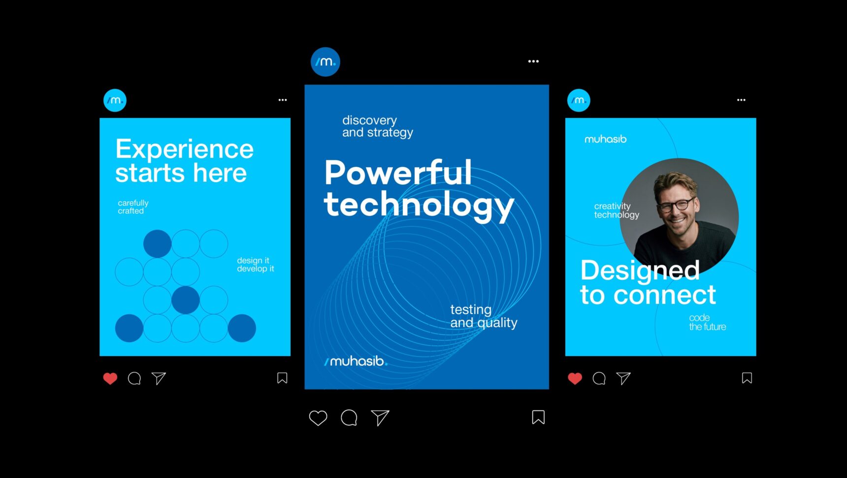
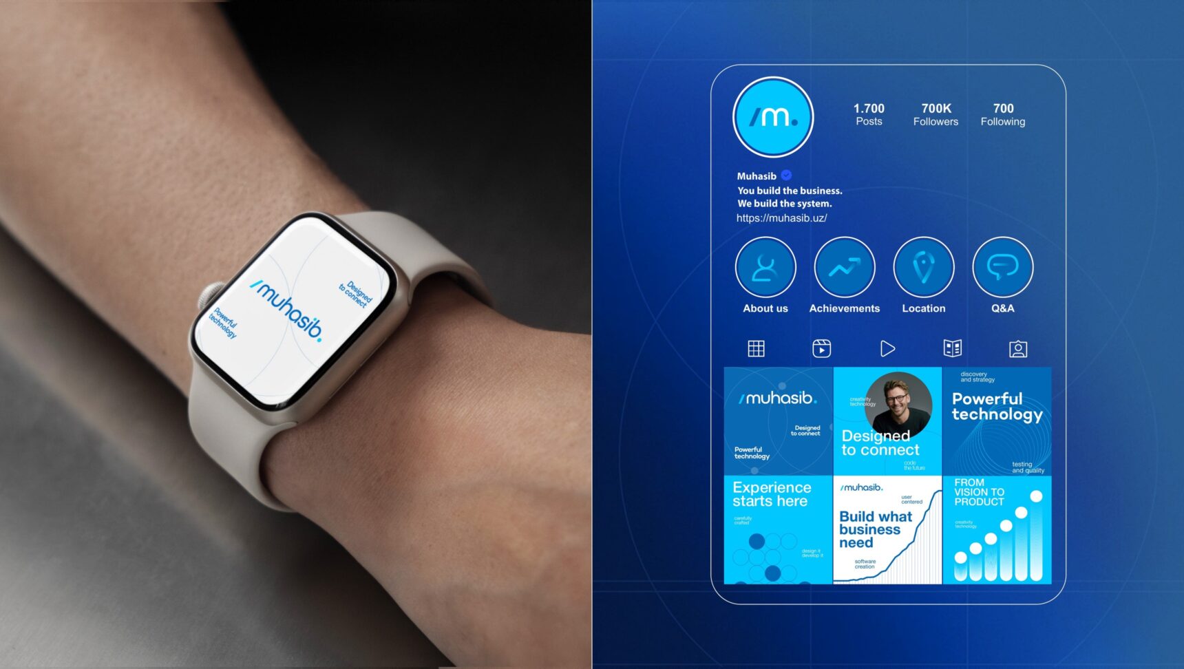
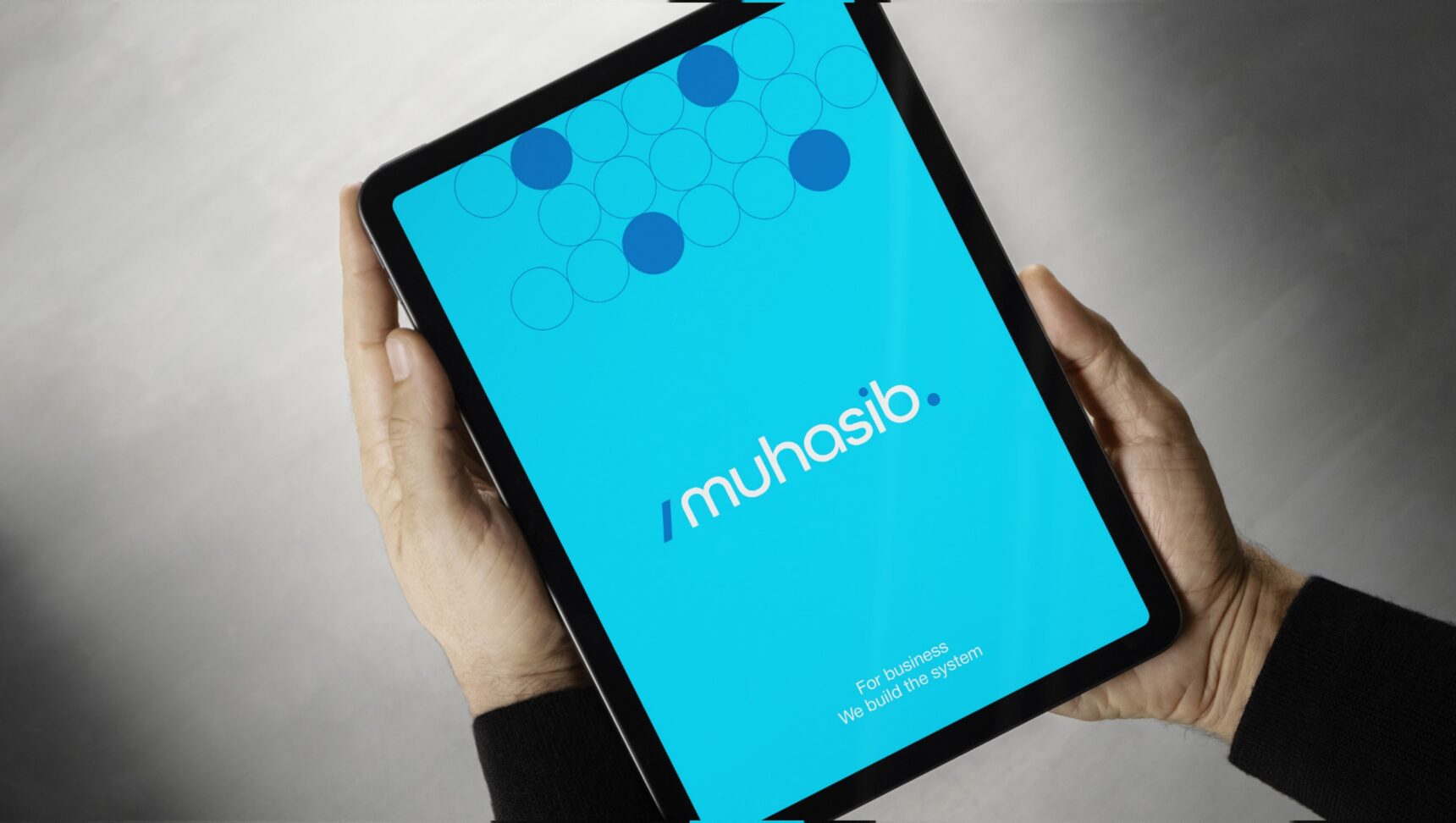
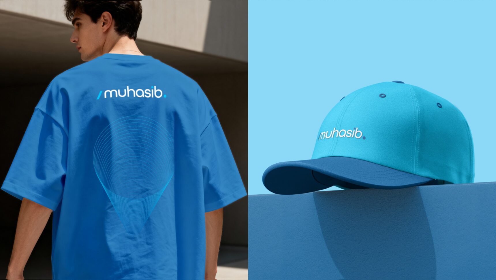
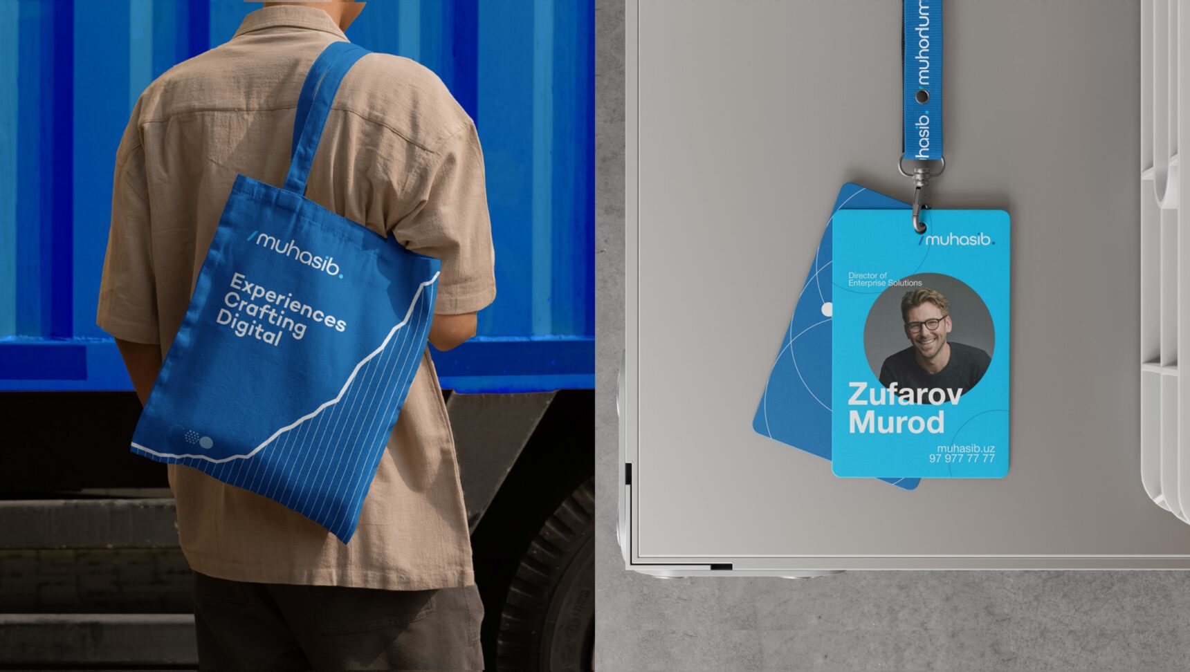
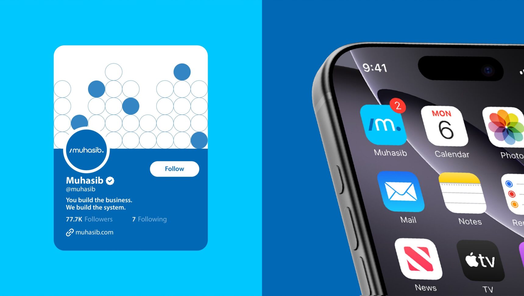
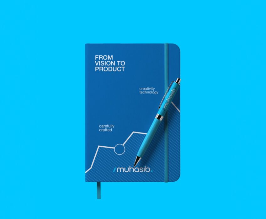
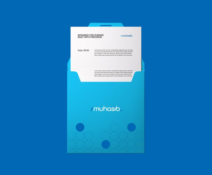
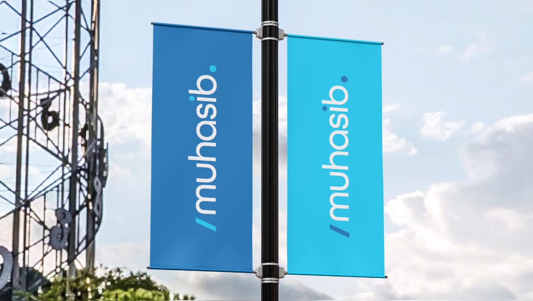
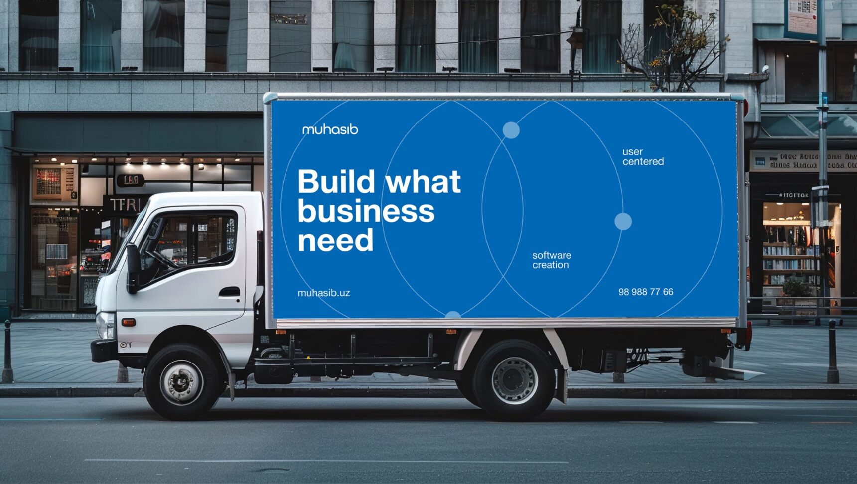
We built the identity of Muhasib: a /m. mark drawn from a closing code tag, a blue palette, circle-based graphics and a full set of applications, from business cards to the office facade.
  • Logo

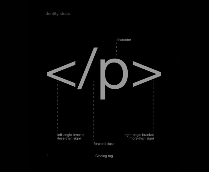
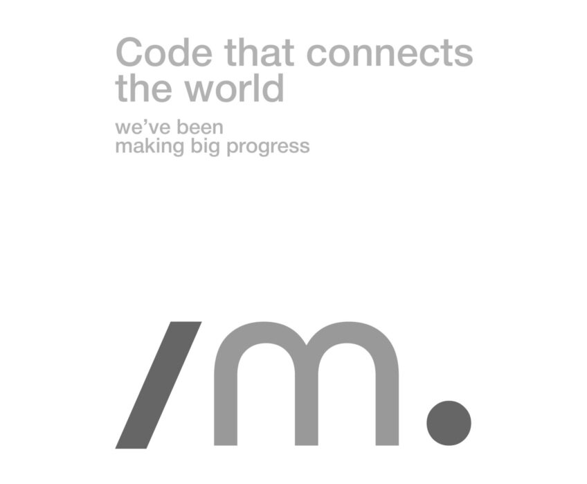
    The slash and dot of the </p> tag became the /m. mark: code that connects.

  • Colour and type

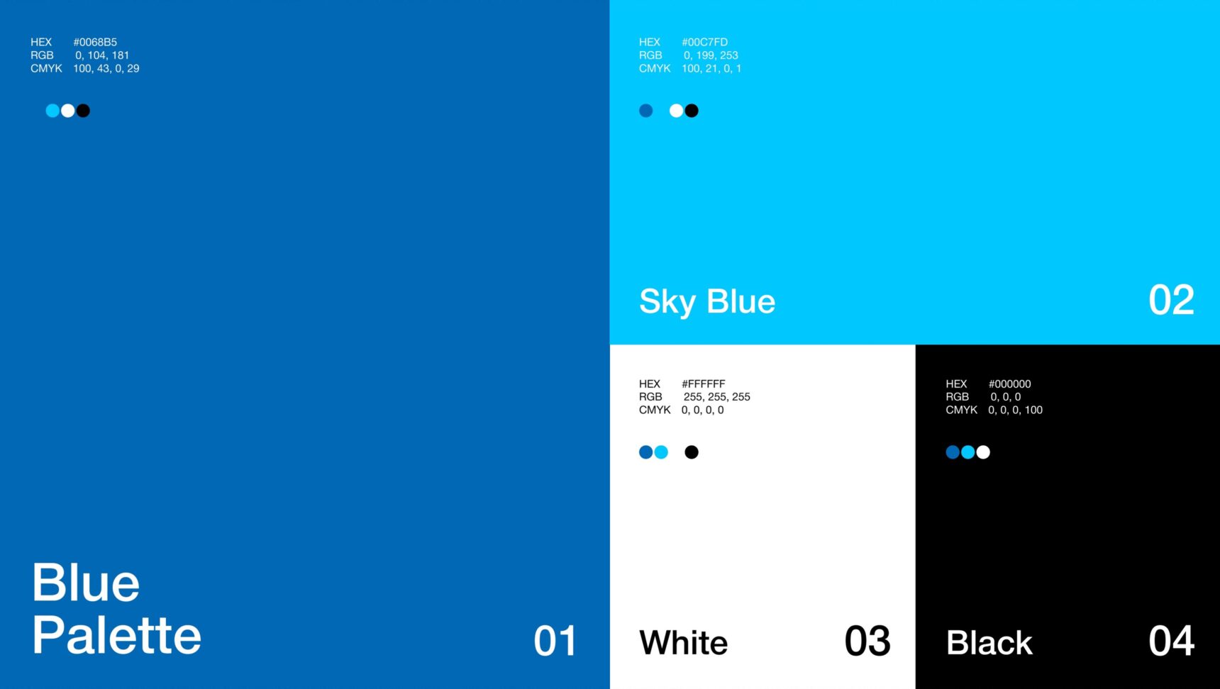
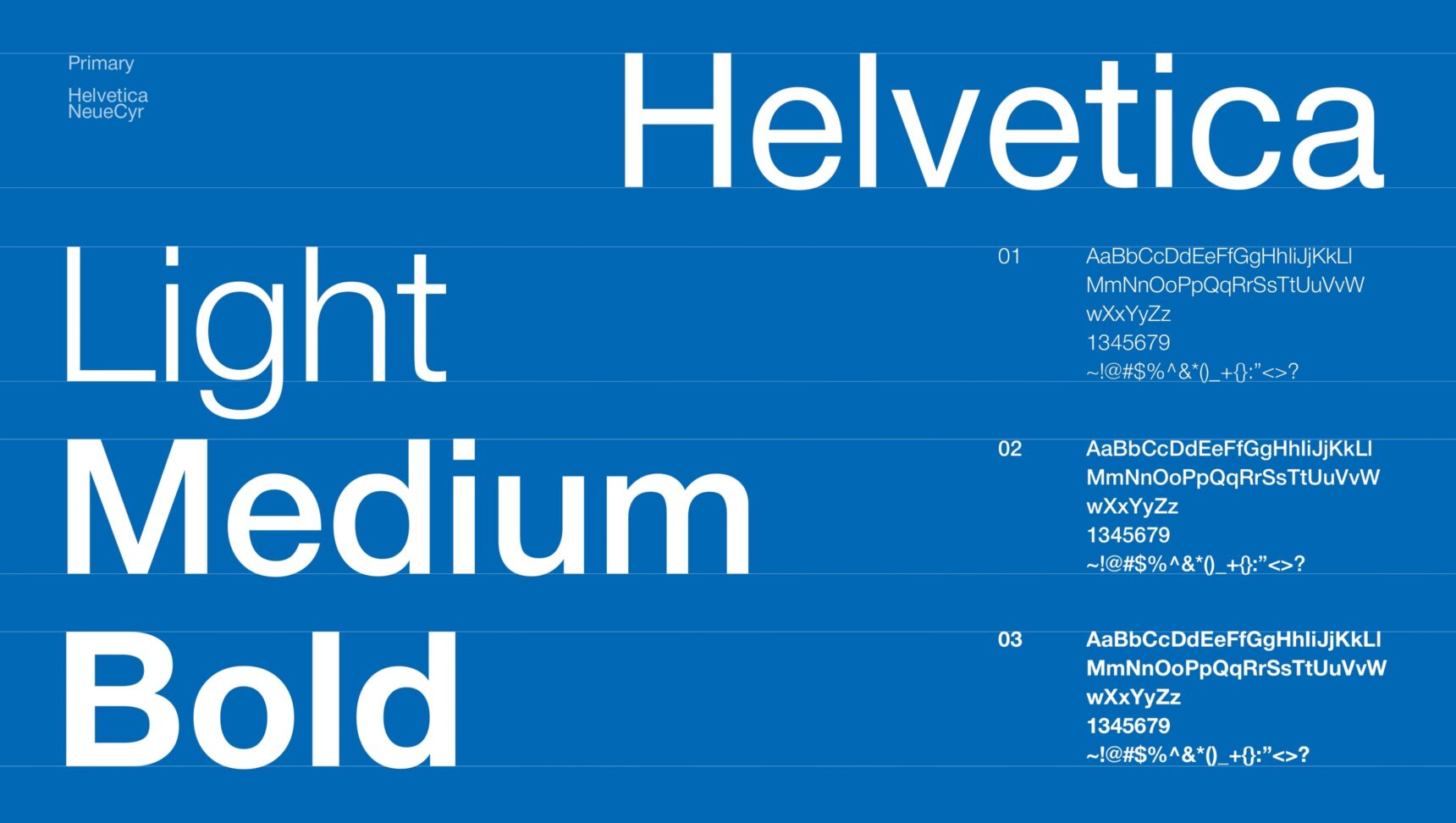
    Brand blue and sky blue with white and black. Typeface: Helvetica Neue.

  • Graphics

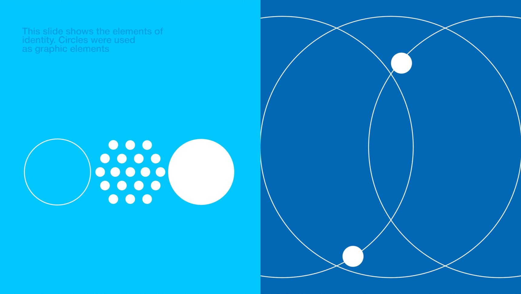
    Circles, dots and orbits, an image of connections and data for posters, social media and merch.

  • Applications

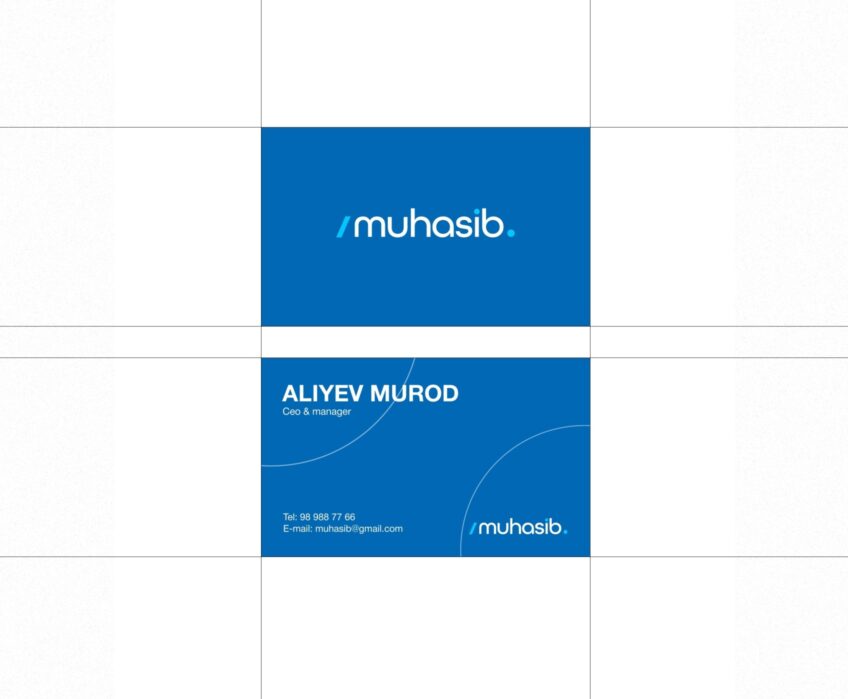
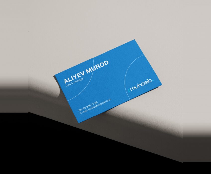
    Business cards, city-lights, billboard, social media, merch, badge, stationery, flags, vehicles and facade.
You may also like these projects:

View cases arrow
    • SMM
    • Instagram

    Pruddy

    SMM for a baby diaper brand

    • SMM
    • Instagram

    FurniGlass

    SMM for a furniture manufacturer

    Learn more arrow
    FurniGlass
    • SMM
    • Instagram

    Bahodirov

    SMM for a cheese producer

    Learn more arrow
    Bahodirov
    • SMM
    • Instagram

    Mono Electric

    SMM for an electrical accessories brand

    Learn more arrow
    Mono Electric
    • SMM
    • Instagram

    YEC Gilam

    SMM for a carpet manufacturer

    Learn more arrow
    YEC Gilam
    • SMM
    • Instagram

    Aventos

    SMM for HVAC and ventilation systems

    Learn more arrow
    Aventos
View cases arrow

Ready to scale your business?

Book a consultation and we will discuss which strategy fits you best.

Let’s Talk About Your Business.

We’ll discuss your goals and current challenges to identify the solutions that best fit your needs.

    close icon

    Отправка резюме

    Заполните форму и приложите файл резюме.

    close icon
    Thank you for reaching out! We’ve received your details. Our team will contact you to discuss your project.
    ×